I was on a little nostalgia trip earlier, hunting out old skateboard graphics. They're surprisingly hard to find. I guess they vanish quite quickly because they're typically displayed as little thumbnails for online shops and not as nice big images. Anyway, I made it my mission to find the first pro-model deck I ever bought... and I did, kinda.
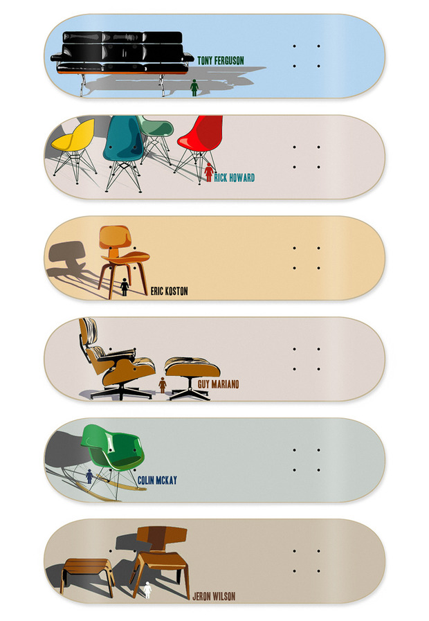
The above image is my recreation of the Modern Chair series of graphics by Girl Skateboards. I had Jeron Wilson's (I didn't know who he was at the time, just that his board was the size I wanted). The decks are of course a beautiful tribute to classic Eames furniture and are apparently a bit of a collector's item nowadays. It's hard to call but I think I must've bought mine around about 1999. Does that sound right? It got well and truly destroyed.
It's weird to think that I bought something so 'designy' as my first skateboard, long before I had any interest or idea that I'd study design and become involved in illustration. Weird not because it was some mystical prophecy of things to come, more that at the time an angsty slogan or dumb cartoon would've been way more appropriate to where my head was.
I stitched these together using this graphic and this collection of thumbnails. The typeface was hard to match and is a little off. Still, I think they work pretty well. Click the image for a bigger version.
Update on 2012-08-14 08:52 by David Galletly
A quick follow up on this post after finally moving it over to my new site (2 years later): Tony Larson, the designer of these skateboards back in 2001, was nice enough to leave a comment here explaining how popular the Modern Chair series has become with collectors. Thanks Tony!
I had a browse through Tony's website and, dun dun dun, you can view his original designs (not my slightly wonky recreations) over here: Tony Larson: Modern Series.